Color page 7 of 9
Color Relationships
Split-Complementary colors: The split-complementary color scheme is a variation of the complementary color scheme. In addition to the base color, it uses the two colors adjacent to its complement. This color scheme has the same strong visual contrast as the complementary color scheme but has less tension.


For most of these examples we’ve been looking at employing saturated colors because they make our demonstrations easier to see. However, lighting designers do not typically use fully saturated colors on stage, instead opting for tints, which are more efficient since they let more light through. Less saturated lighting colors also have less effect on the objects they illuminate.
Complementary colors
What color makes things look their best?
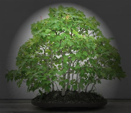
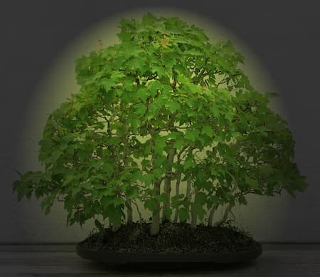
The analogous color, typically the warmer of the analogous color, of the object you’re lighting. Why? Because the analogous contains some of the same color as the original object (which makes it more vibrant) but adds a little more dynamic range due to the lighting color not being pure. Because humans are typically more attracted to warm colors, that’s usually the most flattering choice. For example, what makes green foliage look its best? The two analogous colors for green range from cyan to amber. Both colors contain green, but amber adds warmth. Standard multicolor Christmas lights are not red, blue, green and amber by accident! Those are the three primaries (which mix to create white) plus amber to provide extra warmth and to enhance the green tones.You may even ask yourself why we use colored lights at all on stage! Theatre lighting instruments, when used at full intensity and without color, tend to bleach out the color of costumes and scenery while appropriately colored light can enhance those same costumes, scenery and skin tones.
We have seen that complementary colors in light, when mixed, create white. When complementary colors of low Chroma (saturation) are used, the pigments typically appear enhanced rather than bleached. This enhancement is caused by the brain’s interpretation of the eyes increased stimuli of the cones. White light shows us what we’re looking at, but enhanced white light makes the colors seem to vibrate or ‘come alive’ more, making the same setting appear more interesting.





 © Multimakers Multimedia