
Color page 5 of 9
Color Properties
Emotional responses to color. We must be careful when we begin to tack “emotional baggage” to specific colors because so much of our emotional links come from our individual backgrounds. In the United States, white is the color of purity (marriage), black is associated with death, and yellow reminds most of Spring and the warmth of the sun.
Because of cultural differences and the myriad of hues available along with the fact that color does not actually contain a mood or emotion, but instead promotes an atmosphere that may elicit a mood or emotion, I prefer we examine the properties of major hues instead of their emotional content.

I know a lighting designer who was working with a choreographer from Korea. For opening, he gave her a dozen yellow roses. She fainted in response. In Korea 12 is an unlucky number, and yellow is the color associated with death. 2 strikes and she was out!
Red is the most popular color among women. Often considered the most stimulating color, red can generate measurable changes to body functions. The eye is somewhat insensitive to red as it is the color that can most quickly generate “color fatigue”. Since red is at the far end of one side of the spectrum, deep tints can suppress or dominate other hues a result which can, therefore, elicit a feeling of anxiety or fear.
Red light most naturally occurs during sunsets. Red is the most flattering to all skin colors compared to the other primaries.

Orange, along with red, is considered a “warm” color. As more yellow or green is added to red, light quickly turns to orange and amber. Although orange dampens blue and green, green preserves more of its hue which is typically where a lot of visual detail is kept. Orange (particularly in a pale form) is usually considered a flattering color for skin tones.
Orange light most naturally occurs in association with fire and candlelight, and most reactions to it are positive.

Yellow is often considered a “pure” hue, as most people know it is a primary from its rank in pigments. Yellow has comparatively weak coloring power. Pale tints of yellow are often considered part of white light; the fact that children often draw the sun as yellow is an example of this. At any similar saturation level, yellow appears brighter than other hues, and an increase in saturation is often considered an increase in intensity or brightness. Yellow is often linked with brightness more than with Chroma. Pure yellow conjures cheerful feelings, but if it's corrupted in any way, an easy achievement, it becomes the most unpopular of all colors.
Yellows or ambers which emphasize green over red (often called “straw”) are unflattering to skin tones and elicit negative responses. But, because yellow or amber in combination with blue (its complementary color) creates white light, amber is often used on stage.

Green is the least popular of the three primary colors of light. Green is also the least flattering to skin tones. Green light is very effective for lighting things other than people. A large amount of visual detail is carried in that portion of the spectrum, especially at low levels of illumination.
Green is considered to be the most emotionally neutral of the major hues.
Green light in nature typically occurs after being reflected off of vegetation or foliage.

Cyan is a color that has been associated with beauty, nature, and calming effects since antiquity. The word "cyan" is derived from the Greek word "kyanos," meaning blue. Cyan is a color that is often associated with blue. It is a cool color that can be used to create a feeling of relaxation. It is also a color that is associated with nature, and the ocean. Cyan can be used to create a feeling of peace and serenity. It is also a color that is associated with wisdom and knowledge.

Blue appears in daylight when there's a clear sky. In fact the blue of the sky makes daylight appear warmer, being its complement. The blue tint of an overcast/cloudy day appears drab. Objects in the distance are often affected by a blue shift, which helps us feel disconnected from objects in blue light, and those objects often appear further away because we are so used to this effect.
Blue light accentuates the veins in human skin and subdues natural skin tones, often making people look pale and/or sickly.
Although blue is a popular color, especially among men, it is generally not considered a normal color of light. Producers of fluorescent and Mercury lights go through substantial lengths to add warm tints to their light sources because most people find the normally occurring blue tint of these lights unpleasant and uncomfortable.

Purple and violet are typically considered related. Technically, purple is not part of the spectrum but is a secondary color created by mixing red and blue light. A true violet is the shortest wavelength of light on the visible spectrum and is absent of any red. Most colored filters that are called “violet” contain some red, because visibility and color - filter efficiency are very low in this end of the spectrum. Violet is the “coldest” of the colors, and, therefore, quashes warm tints, thereby making it a gloomy color. When red light is added so that the violet becomes purple, the light color's apparent mood is often lifted.
Purple light rarely occurs in nature, so it is often considered an unnatural color for light.

A quick note about ultraviolet lights:
A black ultraviolet (UV) light looks dark violet, but most of the light it emits is actually in the ultraviolet range of the spectrum, which is invisible to most human eyes. Technically, the receptors in our eyes can see some ultraviolet; however, the lens on the eye filters out ultraviolet because it can be harmful. Therefore. most humans cannot see UV.
The glow we see from UV paints, many fluorescent colored items, and many white fabrics all contain phosphors. A phosphor is any substance that absorbs energy and re-emits it as visible light. While being cast by a blacklight, phosphors convert the UV radiation they receive into visible light which we perceive as glowing. Fingernails and teeth contain natural phosphors, and many laundry detergents include phosphor-based optical brighteners designed to give clothing that “whiter than white” effect.
There are specially designed paints, some of which appear “invisible” under normal lighting, which contains phosphors that are activated under UV. This activation can make for an exciting effect on stage; for example when a daytime cityscape backdrop turns to night when ultraviolet wash is added to the stage.
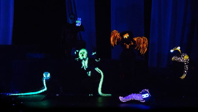
“The Ash Girl” Director and Scenic Designer: Brian Cook,
Costume Designer: Bethany Marx, Photo by Lighting Designer Kade Mendelowitz.
The costumes of some of the characters for this production were painted with UFX paints so that their introductory scene could display how "otherworldy" they were.Images courtesy UVFX Scenic Artists.