Color page 6 of 9
Value & Contrast
Value
Of primary concern are creating, enhancing, or occasionally reducing the illusion of form.
Light can be used to enhance the depth of field in the playing space. Through the use of light direction, temperature, value range, reflection of color, primary and secondary light sources, the intensity of light contrast can help us manipulate the audience's perception of the space and focus of various moments within a production.
Stark, contrasting light evokes a different emotional effect from using soft light. Light defines form. Light can control the perception of the audience, help focus attention, and manipulate feelings.
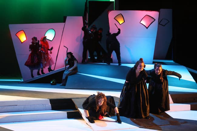
Color production photo from "Hamlet Dreams" by Scenic and Lighting Designer Kade Mendelowitz
Not all color is created equally. Each color has its own inherent value range. When a color value is applied to lighting color media (gel), the result partially explains why some colors have lower transmission rates than others. More wavelengths need to be absorbed from dark colors than those with less value.
Contrast is really the key to lighting.
Contrast is the state of being different from something else. People need contrast (between the letter and the page or screen) in order to understand what they are reading. Contrast allows us to see what we see and to understand what we see. Contrast can be manipulated through the various elements of design, but since this segment is about color, let's focus on value and vibrancy. Value is the relative lightness or darkness of a color. Value is of critical importance, and one could argue that a change in intensity (because it affects the value of what we see) is de facto a change in color. Vibrancy is the relative saturation or intensity of color. A change in value, which primarily happens at the edges of things (whether they be 3-D objects or the hard edge of a painted texture), is what allows us to see detail and discern between objects.When contrast is created by using more than one element of color, such as value and saturation, we can create a vastly more interesting image. The strongest point of contrast can be created by using different values and complementary colors. When both of those tools are employed, designers begin to make very dynamic visual images.
As viewers, we first look at the highest level of contrast. Our ancestors likely developed this skill to understand information from shapes by what is implied. This helped them discern the difference between things that were harmless or threatening. We instinctually understand that sharp, pointed things remind us of what can hurt us, while soft edges make us think of organic forms.
Knowing that we look at an image or a stage space beginning with the area that is visually brightest or of highest contrast helps the lighting designer draw attention to where we want the viewer to look.
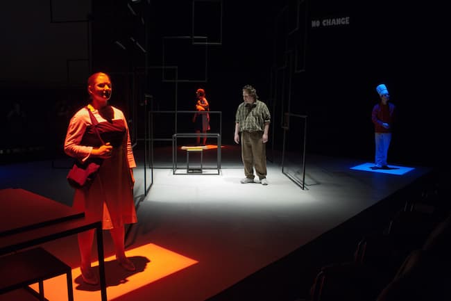
Production photo from "All in the Timing" Lighting designed by Thomas Creek