Developing the Design Idea
One must take all factors into account, primarily the character who needs to be lit.
How should the character's form be revealed? Should it appear clear and with a great deal of dimension, or should it appear more like a caricature?
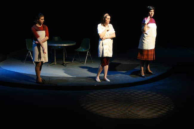
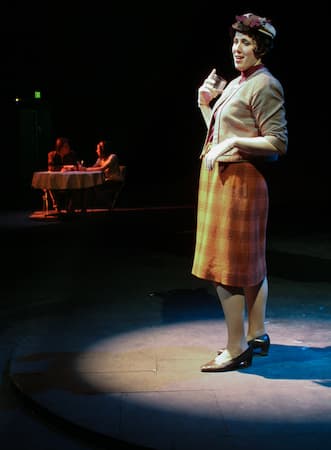
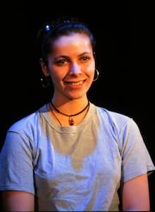
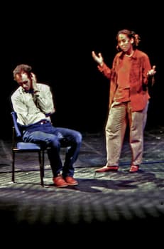
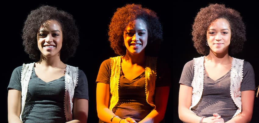
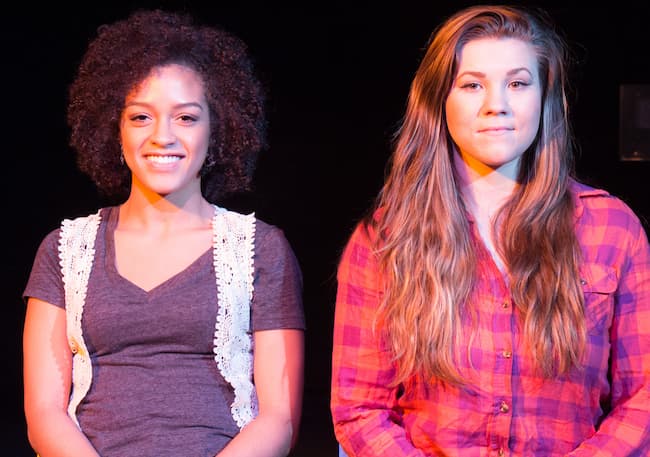
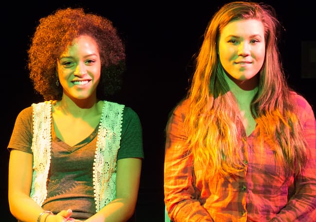
| In this (next two photos) production of “How I Learned to Drive”, most of the actors played multiple roles, part of Li'l Bit’s family and part of the ‘Greek Chorus’. Scenes changed very quickly, so complicated costume shifts were unrealistic. Here, Hadassah portrays Li’l Bit’s mother (right, more dimensional) and an unnamed school-girl (left). The lighting helps reflect the difference in characters as well as their change in location. |
Lighting, on its surface level, can be analyzed by “visibility.” Visibility is the ability to see the character's face, eyes, movements, and “plasticity” or three-dimensionality. Does the character seep into the background? If his/her eyes are difficult to see, will the character be easily trusted?
Should the character look so “realistic” and natural, that the audience can easily identify with him/her?
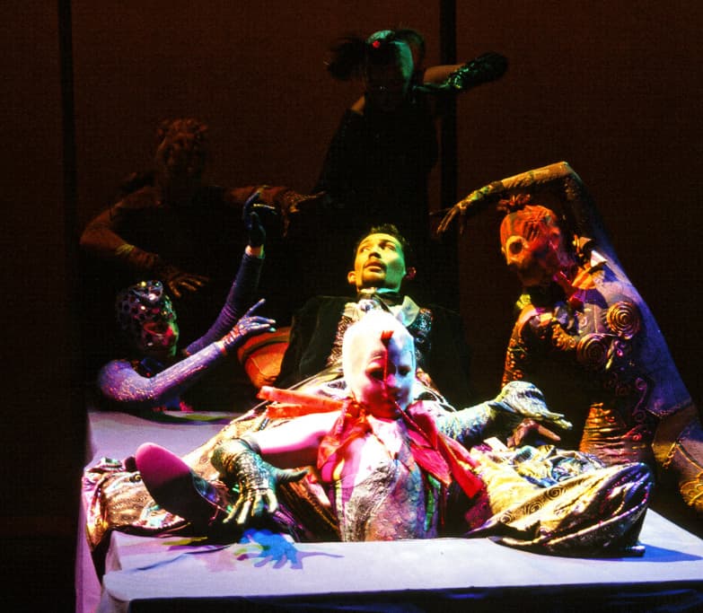
A great deal of form revelation comes through the use of angles or the directionality of light.
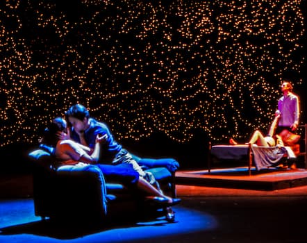
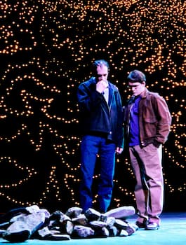
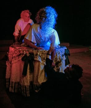
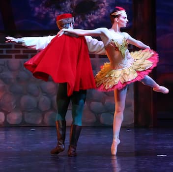 "Firebird" production photo by Paul McCarthy. Lighting by Kade Mendelowitz |
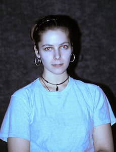
People often remark that their driver's license photograph doesn't look like them. In a way they're correct. The lighting is usually from a flash by the camera, coming straight towards them and filling in areas that are usually in shadow.
The bright light from a camera flash appears to “flatten” people. It can hide the natural contours that are expressed normally by shadow under the eyebrows, nose and chin. Lighting in the theatre can also have this “flattening” effect, and there, too, the characters will appear unnatural.
Note: I will often refer to what appears to be “normal” or “natural” lighting. You should not confuse these types of statements as “good” or “bad”. Each look, whether “normal” or “supernatural”, has its appropriate time for usage. It is up to the designer to judge what the correct look for the scene is.
However, if the lighting is too unnatural for too long, it may cause eye fatigue, or the audience may simply get annoyed. Imagine watching a physical comedy for three hours and never quite being able to see the character's face clearly!
In addition to how a designer reveals the form of the character's body – the designer must be sure intensity and color fit as well.
The angles of the light between a moonlit night and the midday sun may be similar; therefore, intensity and color must also support the goal of the lighting.
Hair and skin color should also be considered when thinking about the production. I've already mentioned (and will again) how important it is for the lighting designer to consider the other design elements. To consider both the other design elements and the actors themselves who will be “under the lights.”
Actors come in all shapes and sizes. They also come in all sorts of skin and hair tones. The differences between a pale white person and a tanned white person can be severe, just as there are lighter and darker colored people.
Some people have olive or green-based skin color. Others have pink or yellow-based skin. The lighting designer should pay attention to these crucial details.
I was once the touring lighting supervisor for a production of “A Midsummer Night's Dream”. The actor playing King Oberon was a very dark-skinned black man. Against the black legs and backdrop his face virtually disappeared - especially because he was bare-chested through a large portion of the show. The lighting designer asked the costumer to help, and she gave him a gold band around his head. Isn't designer collaboration a wonderful thing?
The lighting designer must pay special attention to racially mixed casts. In addition, the designer should consider hair color when choosing back or down light colors. Although down lights don't affect costumes and facial features as much as do front lights, the top light may dramatically affect hair color.
When setting preliminary lighting levels, I find it helpful to have an assistant familiar with the blocking of the show, dressed in clothing similarly colored to the costumes, and to be of similar skin and hair color to the main character on stage for me to use as a model.
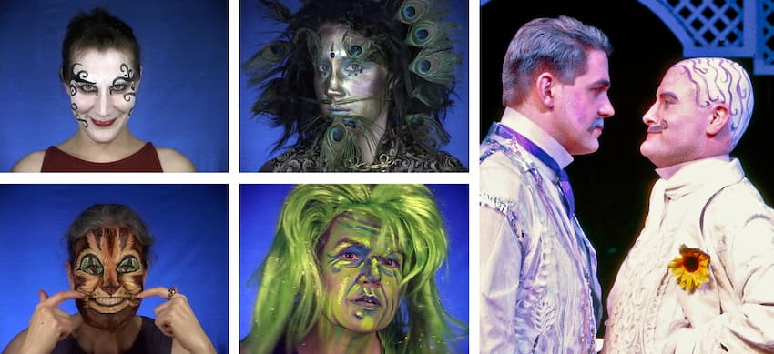
Makeup will naturally affect the color of the performer’s skin. Wigs or hair colorant may also play a part, so it is important for the lighting designer to find out about these areas in addition to each character's costumes.
Prosthetics are becoming more and more popular in the theatre. These also may affect the use of angles or colors as they appear on the performer.
Lighting should also support the physical appearance of transitions the performers may go through during a show. Someone unattractive, untrustworthy, or burdened at the beginning of a play may change to become an honest, cared-for, happy individual by the end of a show. The lighting for that character should help reflect these changes, just as characters in a dream sequence could, or should, appear different from their appearance during the “real time” of a production.
I find it very useful to work on a production for as long as possible before the final design is actually due. This way I can think about it on my own time instead of forcing myself to concentrate heavily on the show.
I have often been inspired with a strong feeling for a production while being in an unlikely situation or place: in the bathroom, taking a shower, driving my car, etc. During all of these activities, while not specifically focused on a show, I have come up with some of my best ideas.
| When the design image comes to me by itself, the complete process seems to lead me through the production. I like to leave a base plan for the theatre, with the set sketch, rendering or groundplan, mounted on my drafting board in my apartment. This habit allows me to look at sporadically while I am working around it, doing other things. |
Whether it comes easily or not, creating a picture in the “mind's eye” is an important part of the design process.
Sometimes I can envision a picture or many subtle cues for each scene. Other times it may be possible to come up with one picture for the entire production.
Continue to look at the script, talk to the other designers, or watch a run through for inspiration. This practice will hint at the overall “look” for each scene in the production. Doing this will make the rest of the process go more smoothly.
| The time I step away from thinking directly about the show is often called “incubation”. I feel this is one of the most important times for a designer - it allows the show to talk to you, instead of you having to go to it looking for answers. |


 © Multimakers Multimedia